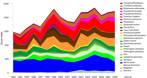
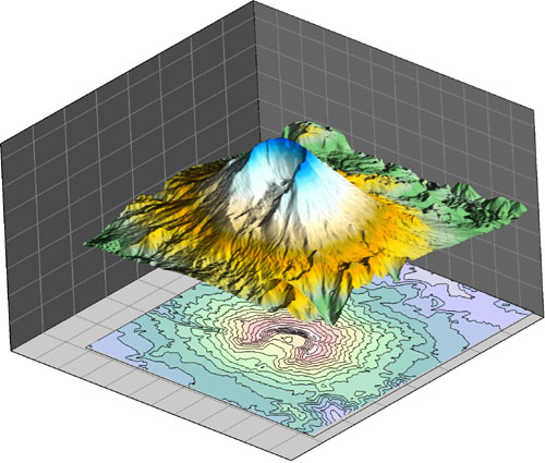
Image courtesy of Mats Blomqvist, Hafok AB, Stenhamra, Sweden
Line/scatter plots can have multiple axes and curves. You can change line properties for individual curves or fill curves.
Class scatter plots allow symbols to be based on a range of data values in a worksheet column. In addition to class scatter plots, regular symbol plots can be created with different symbols based on information in a column or in a symbol table.
Class scatter plots have variable symbols with separate properties. Symbol size, shape, and color can change depending on the value in your class column in your worksheet.t.
Function Plots display mathematical functions. Plot Y as a function of X, or plot a parametric equation where X and Y are a function of a third variable, T.
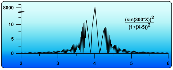
Specify a function or equation to create a graph. Position the axes anywhere on the page. Break axes to reveal interesting trends in your data.
Step Plots display linear data in a similar manner to line/scatter plots. Except, with step plots, connecting lines are only vertical and horizontal. All other parts of the plot are editable exactly like the line/scatter plot.
Legends and graph titles can add informative information to any graph!
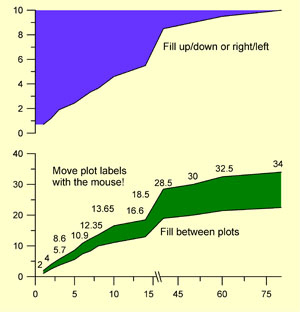
Display line/scatter plots over any axis range, using the default full axis range or specifying only the section you want to display on the graph. And with Grapher you can add color fill between plots to produce dazzling displays of your data.
Linear Graph Features
- Display lines with any color, width, opacity, or style.
- Use a worksheet column to change the color of lines within the curve.
- Display symbols with any shape, color, or opacity.
- Change the frequency of symbols to control how many symbols are plotted on each curve.
- Use a symbol table to vary the symbol for every point.
- Use a symbol column to define the symbol shape from a worksheet column.
- Match the color of the symbol to the color of the line automatically.
- Drag point labels to place them exactly where you want.
- Fill under, above, to the left, to the right, or between curves.
- Add fit curves and confidence intervals.
- Add error bars that display statistical information about the data. Error bars can also be displayed from a worksheet column.
- Limit the display of lines and symbols to only a desired subsection of data.
- Use a worksheet clipping column to control the display of points.ù
- Add a graph title or legend to enhance your graph.
- Automatic or user-defined contour intervals and ranges
- Adjust the opacity of all objects in the graph.
Bar Type Graphs
Bar type graphs display data as boxes, cones, spindles, diamonds, or as an image. All bar type graphs can be displayed either horizontally or vertically. As with all graph types in Grapher, you have full control over all graph parameters.
Bar charts are made from XY data in a worksheet. The bar is shown at the height indicated in the worksheet cell. Alter line colors, fill colors, orientation, or bar chart shapes. Bar charts can be stacked or adjacent, when multiple data exists for each value.
I like the consistent improvements in new Grapher versions while keeping the proven features.
-Jakob Schwander, University of Bern, Switzerland
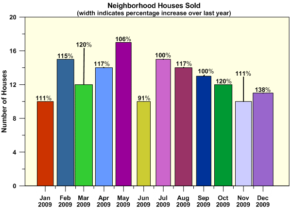
Bar charts can be filled with different colors, display labels, or be variable widths, depending on your needs and preferences!
Floating bar charts display similar data except that the bar has both a minimum and maximum defined in the worksheet. All settings can be changed in a manner similar to bar charts.
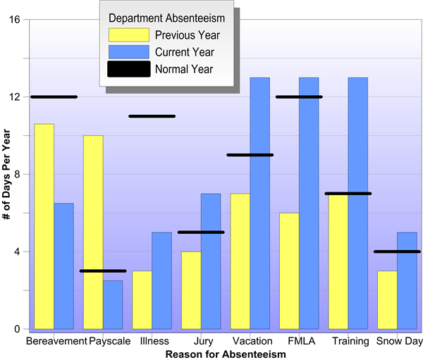
Image courtesy of Phill Muller, Software Technologies, USA
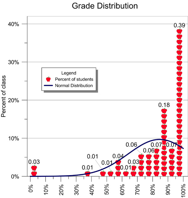
Histograms display data in groups or bins. Each bin represents a range of values on the X axis. The height of a bin represents the number of data points that fall within that bin’s range. Histograms can display data as a count or as a relative frequency.
Display horizontal or vertical bars! Add text labels, overlay multiple bars, or use dates--whatever you want to display; Grapher has a way to make your data stand out!
Use an image fill to make your graph more exciting! Add legends, labels, and fit curves to more accurately represent your data.
Bar Type Graph Features
- Display bars either as stacked or as adjacent bars.
- Vary the bar width based on a worksheet column.
- Set the bar width to a percentage of the axis or as a fixed width.
- Display bars vertically or horizontally.
- Display lines with any color, width, opacity, or style.
- Display fill with any color, gradient, style, or opacity.
- Use a worksheet column to set fill color.
- Use a color table to set fill color.
- Display bars as boxes, cones, spindles, diamonds, or any image you desire.
- Change the frequency of symbols to control how many symbols are plotted on each curve.
- Add labels to your bars.
- Drag point labels to place them exactly where you want.
- Add a fit curve to histograms.
- Add error bars that display statistical information about the data. Error bars can also be displayed from a worksheet column.
- Limit the display of bars to only a desired subsection of data.
- Use a worksheet clipping column to control the display of points.
- Add a graph title or legend to enhance your graph.
- Adjust the opacity of all objects in the graph.
Polar Graphs
Polar plots display data on polar coordinates, using degree, radian, or grad data versus a radial distance. The degree, radian or grad data are displayed on a circular angle axis. The second axis is a radial axis showing the distance from the center of the circle. Polar plots can display mathematical functions, line/scatter data, bars, or classed scatter plots.
As with all graph types in Grapher, you have complete control over all aspects of the graph. Polar line/scatter plots display data as a line, as symbols, or as a combination of line and symbols. Alter line colors, symbols colors, or add labels.
"Overall, I'm very impressed with the improvements! Well done on improving a great bit of software."
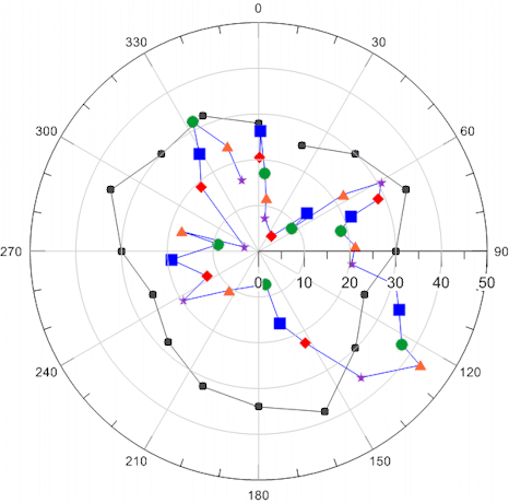
Polar line/scatter plots can use the same symbol or varied symbols for point locations. Add lines connecting the points or display only the symbols.
Polar class scatter plots allow symbols to be based on a range of data values in a worksheet column. In addition to class scatter plots, regular symbol plots can be created with different symbols based on information in a column or in a symbol table.
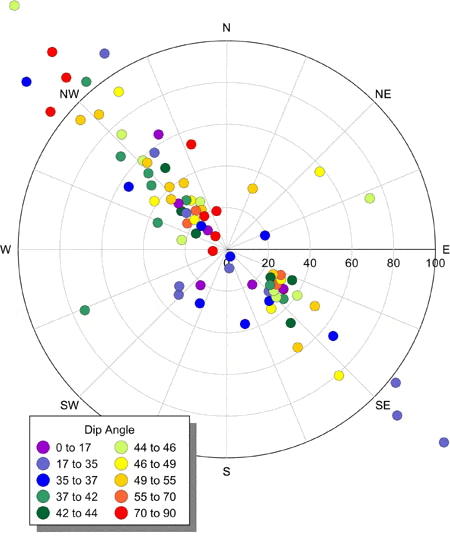
Display classes with different colors or shapes. Limit your points to inside the polar area or allow points to go outside the area. Use axis text labels for clarity.
Polar bar charts are bars that are displayed using radius and angle values in a worksheet. The bar is shown at the length (radius) indicated in the worksheet cell. Alter line colors, fill colors, or bar width. Bar charts can be stacked or adjacent, when multiple data exists for each value.
Stacked polar bar charts allow comparison of multiple sets of data on polar axes.
Polar function plots are lines, symbols, or both that display a mathematical function in polar coordinates.
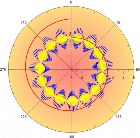
Create multiple plots on the same graph and add colors to differentiate between each curve.
Radar graphs, also known as spider plots, are new in Grapher 8! The radar plot has a similar appearance to other radial graphs, except there are multiple radial axes and no angle axis. A radar graph is a graphical method of displaying multiple variables. Comparisons between multiple radar plots typically show trends in your data.
Radar plots have an additional axis for each new variable. Display multiple data sets on the same graph, overlaying the plots, and filling with a partial transparency to see all the options.
Rose diagrams display statistical data like a histogram, showing the number of occurrences of an event that fall within a specific angular region. Bins are fully customizable in rose diagrams!
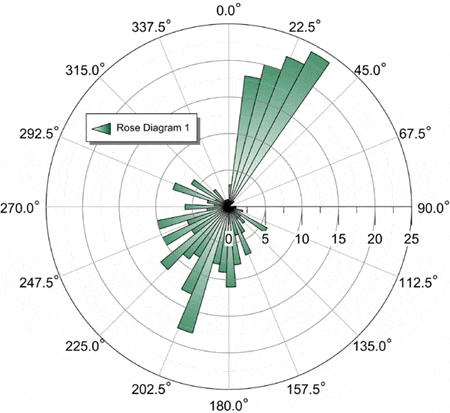
Show unidirectional or bidirectional data on a rose diagram.
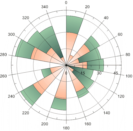
Wind Charts graph frequency vs. wind direction. Bins are created according to the wind speed. The frequency can be viewed as counts, relative frequency, or as percentages of relative frequency. Bins are fully customizable!
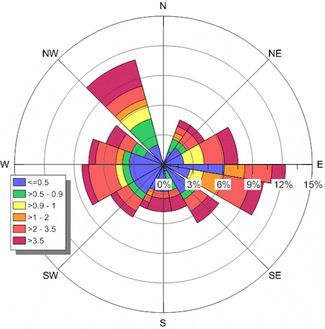
Display polar wind charts using class colors. The stacked classes reveal the total distribution in each wind direction.
Polar Graph Features
- Display any portion of the polar plot.
- Display polar bar charts either as stacked or as adjacent bars.
- Vary the bar width based on a worksheet column.
- Display lines with any color, width, opacity, or style.
- Display fill with any color, gradient, style, or opacity.
- Use a worksheet column to set fill color.
- Use a color table to set fill color.
- Change the frequency of symbols to control how many symbols are plotted on each curve.
- Add labels to plots.
- Drag point labels to place them exactly where you want.
- Use a worksheet clipping column to control the display of points.
- Add a graph title or legend to enhance your graph.
- Adjust the opacity of all objects in the graph.
Specialty Graphs
Specialty graph include graphs such as box-whisker plots, ternary diagrams, or stiff diagrams. Each graph has its own rules and displays in a completely unique way. As with all graph types in Grapher, you have complete control over all aspects of the graph.
"I like the wide variety of graph types available, and the intuitive feel of the program."
Box and whisker plots display statistical data. Each column is assigned to a box. The box top-bottom values are defined by the 25th percentile and 75th percentile. The whiskers are the minimum and maximum values, unless outliers are defined. Then, the whiskers can be changed with an outlier definition. Box and whisker plots allow complete control of all line colors and styles, symbol colors and shapes, and fill colors. Label every portion of the box-whisker plot for maximum clarity.
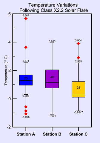
Display outliers on a box-whisker plot as symbols or as whisker
lines and label all portions of the box and whisker plot.
Compare multiple sets and change the properties of each.
Bubble plots display three variables on two axes. The third variable is shown in the size of the bubble. All aspects of the plot can be changed, including the bubble symbol, line properties, and whether labels are shown.
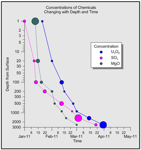
Bubble plots display variable symbol sizes, based on data in a column.
Axes display with multiple options such as dates or reverse direction.
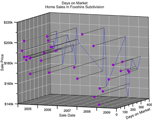
Hi-Low-Close plots display a range of Y values at each X value. These plots are commonly used to display the high, low, opening and closing of stock values, though Hi-Low-Close plots are also used for many other purposes. Hi-low-close graphs can be displayed with the standard line or with bars, the "candlestick" graph.
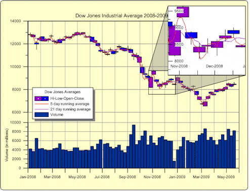
Display multiple axes and multiple graphs on each page.
Add a graph magnifier to highlight a subset of your data.
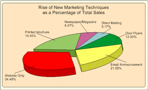
Pie Charts show data as proportional slices of a circle. Each data value is divided by the sum of the data to determine the size of the slice. Explode slices to emphasis a particular item! Change the property of each slice individually.
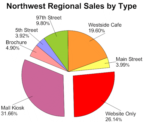
Pie charts can show multiple slices, with full customization of each slice,
including labels, fill color, and explosion factor.
Stiff diagrams can be used to display water quality. Stiff diagrams show relative concentrations of multiple cations and anions.
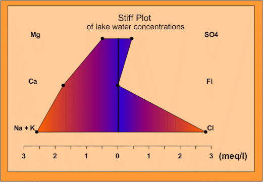
Stiff plots can be color filled to aid in the interpretation of the graph.
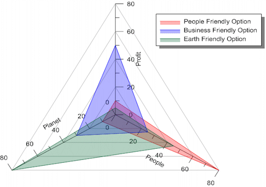
Ternary diagrams show the relative proportions of three variables on three axes. Choose to show the relative proportions as percentages or as fractions. Add lines to connect the points on the ternary diagram! Display any column for the labels or show relative proportions for labels! Zoom in on an area of interest!
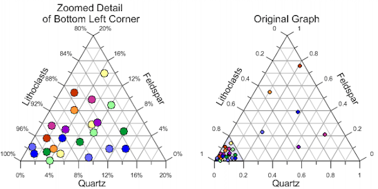
Zoom in on a section of a ternary diagram to reveal more detail!
Vector plots are used to show the starting and ending point of a variable, such as wind or current. Grapher allows you to set the starting XY position. The ending position can be specified with angle and magnitude or ending XY position.
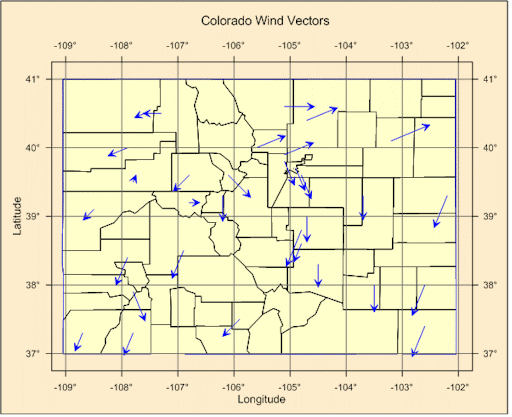
Add line/scatter base maps to add locations to your vector maps!
3D XYY Graphs
The 3D XYY graphs are graphs that contain two variables and are displayed with a 3D view. Most 2D XY Graphs can be displayed as a 3D XYY graph.
"What really buys me is the exceptional quality of figures achievable (everyone could achieve) with Grapher."
– Igor Yashayaev, Bedford Institute of Oceanography, Canada
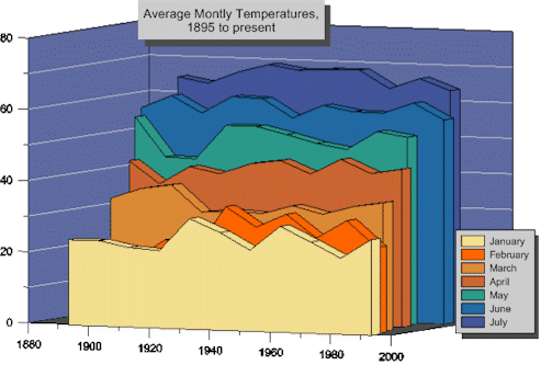
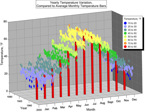
3D XYY graphs display the same types of plots as 2D XY graphs, but with a 3D view.
These adjacent ribbon/wall plots are one example of the ways to move the plots in 3D space.
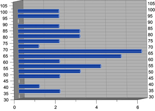
This 3D XYY histogram is displayed horizontally with a cylinder for each bin.
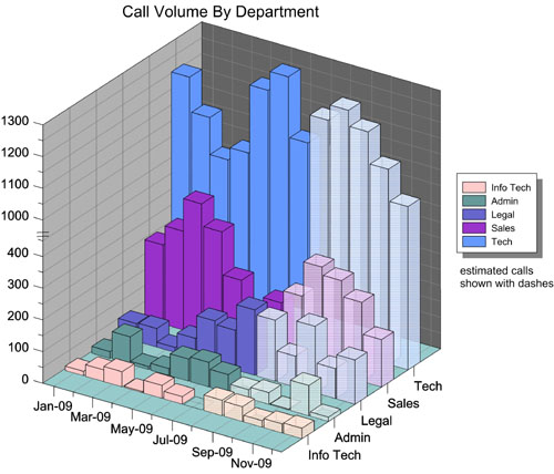
All 3D XYY bar chart type graphs can be displayed vertically or horizontally
with different shapes for the bars.
3D XYY pie charts add an extra oomph to your pie charts
for the most visually appealing presentation possible.
3D XYY Graphs Features
- Rotate graph to any direction with the easy to use 3D trackball.
- Make the width of the 3D XYY graph from 0 to 6 inches.
- Add grid lines on the side walls and back wall.
- Change the fill color or style for the side walls and back wall.
- Show labels at the same angle as axes or parallel to the screen.
- Most 2D plot settings apply to the similar 3D XYY plot.
- Add a graph title.
- Add a graph legend.
- Change the line color, width, or style for any plot.
- Change the fill color, direction (if applicable), and pattern for any plot.
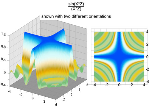
3D XYZ Graphs
The 3D XYZ graphs are true 3D graphs that contain three variables. All aspects of the graph can be altered, exactly like the 2D and 3D XYY graphs.
"The program keeps getting better & better."
Break axes, display date/times, or add legends and text.
Grapher has an unlimited number of ways to present your data!
Combine graphs such as class scatter plots and bar charts to more effectively display your data!
Add a projection and drop lines to any wall of the 3D XYZ line/scatter plot graph!
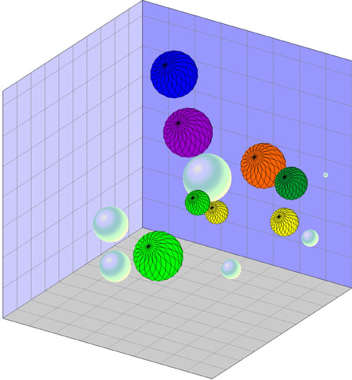
Use a 3D XYZ bubble plots to display four variables, using the size of the bubble
as the fourth variable! Use gradient colors or solid colors for bubble color!
3D XYZ Graphs Features
- Rotate graph to any direction with the easy to use 3D trackball.
- Make the length of each axis on the 3D XYZ graph from 0 to 6 inches.
- Add grid lines on the side walls and back wall.
- Change the fill color or style for the side walls and back wall.
- Show labels at the same angle as axes or parallel to the screen.
- Add a graph title.
- Add a graph legend.
- Change the line color, width, or style for any plot.
- Change the fill color, direction (if applicable), and pattern for any plot.
- Add symbols to 3D XYZ line/scatter plots.
- Display labels and move them to your desired location.
Contour Maps
Contour maps can be displayed over any contour range or interval. You can color fill the contours in any way you would like. Add a color legend to make reading the contour map even easier! Contour maps can be created directly from a data file or from a Surfer GRD file. As with other graph types, you have full control over all options.
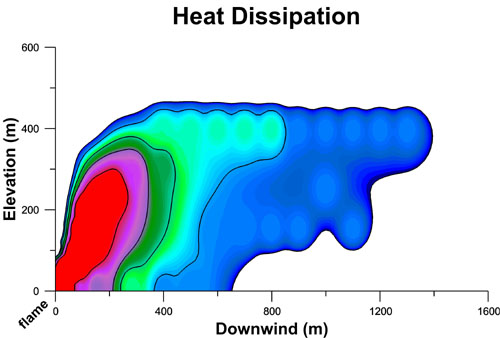
Contour maps can be color filled to highlight your data!
Contour maps can be added to surface maps to aid in interpretation!
Contour Map Features
- Use the defaults or set the minimum and maximum contour values and the contour interval.
- Display any fill color between contours.
- Display lines with different styles, colors, and widths for each contour line.
- Add a color scale bar legend.
- Grid data directly in Grapher using Inverse Distance to a Power.
- Import grid files from Surfer!
- Smooth grid contour lines.
- Display contour maps in XY or XZ plane.
- Overlay a contour map onto a surface map or display the contour map at any elevation.
- Rotate the map to any desired angle.
- Define custom line styles and fill styles.
Surface Maps
Surface maps display XYZ data in a smooth color filled surface. Surface maps use color and shading to emphasis changes in data.
Rotate the surface map to any desired angle.
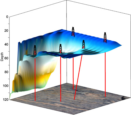
Add 3D line/scatter plots. For example, this 3D surface map displays
an open pit with drill holes penetrating to the bedrock below.
Surface Map Features
- Display functions, grids, or data as a surface map.
- Display any fill color spectrum for your surface.
- Add a color scale bar legend to explain the data values corresponding to each color.
- Specify surface color gradation, shininess, base fill and line color.
- Overlay contour maps, surface maps, and other 3D maps to more fully show your data.
- Control mesh line frequency, color, style, surface offset.
- Set lighting horizontal and vertical angles, ambient, diffuse, and specular properties.
- Choose overlay resample method and resolution, color modulation (blending) of surface and overlays.
- Grid data directly in Grapher using Inverse Distance to a Power.
- Rotate the map to any desired angle.
Customize Your Graph
Graphs can be customized in many different ways. Each portion of the graph can be altered to fit your needs.
"It really is the most flexible package out there. I tell people, if you can visualize a plot, you can make it with Grapher."
-Eric Tappa, University of South Carolina, USA
Customize your graph in any way you want,
change color fill, add magnifiers, text, and axis labels.
- Add legends, graph titles, and axis titles and labels.
- Show tick marks at any interval.
- Show date/time or labels from a worksheet on axes.
- Display point labels on most graph types.
- Rotate graphs to any desired view.
- Change the axes lengths to meet your needs.
- Customize any color to make exactly the right shade or hue.
- Set the axis limits to any values, regardless of your graph data.
- Add symbols, polygons, polylines, spline polygons, spline lines, or text.
- Add a drawing insert zoom or a graph magnifier.
- Add multiple curves to each graph.
- Add multiple axes to each graph.
- Display multiple graphs on a page.
- Define custom line styles and fill styles.
Fit Curves
Curve fitting routines help depict trends in your data. Select pre-defined fits or define a custom fit to add to the graph. Display fits for Line and Scatter Graphs, Step Plots, Polar Graphs and Histograms.
"Grapher 9 is a full-featured scientific graphing package, allowing the user to import data in many formats, create and combine a wide variety of 2- and 3-D plot types, and customize the plots in infinite detail."
– David Suder, Precise Environmental Consulting, USA
Image courtesy Gael Ulrich and P.T. Vasudevan,
University of New Hampshire
Add fit curves to highlight trends in your data.
- There are 11 pre-defined curve-fitting algorithms in Grapher:
- Linear
- Power
- Orthogonal Polynomial Regression
- Weighted Average
- Logarithmic
- Spline Smoothing
- Linear through Origin
- Gaussian (available only for histograms)
- Exponential
- Polynomial Regression
- Running Average
- Associate any number of fits with a single curve.
- Change the line style, color and width for each fit.
- Applicable statistics are available for each fit.
- The resulting statistics are copied to the clipboard or displayed in a report window.
- Export fit curve data to a worksheet to calculate additional statistics.
- Change the range of data used to create the fit curve and the range of values to display the fit curves individually.
- Clip fit curves to any portion of the graph.
- Add confidence intervals to your fit curves to show the degree of confidence that is in the fit.
- Fill between confidence upper and lower bounds to highlight the certainty.
- Clip confidence intervals to any portion of your graph.
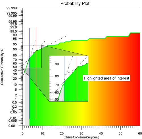
| Axis Types Grapher has four axis scales: linear, logarithmic (base 10), natural logarithmic, and probability. Use Grapher's default settings or specify custom settings for all axis parameters. Set the axis scale, change the axis length and starting position, add additional or duplicate axes, change axis limits, enter an axis title, add grid lines, break the axis, or hide the axis on your graph. On each axis, you control the major and minor tick frequency and spacing or you can use Grapher's default settings. If the data uses date and time as one of the data columns, axis labels are automatically generated using dates and times. Set the major and minor date/time labels separately for maximum control. In addition, manual date/time labels can be created or labels can be read from a worksheet, allowing you to use any type of tick labeling. |
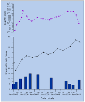 Create axes with different scales. Control label formats for each axis to create the graph you need. |
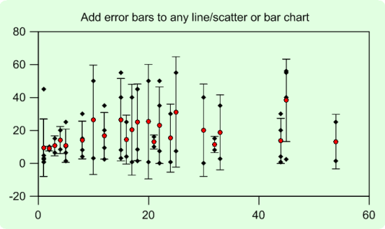
| Error bars Error Bars are displayed on Line and Symbol Graphs and on Bar Charts. Display error bars for the average value, sample standard deviation, population standard deviation, or standard error of the mean. Or, calculate custom error bars in the worksheet and display them on the graph. |
|
 |
|
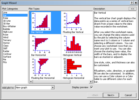
| Graph Wizard The updated Graph Wizard is an easy to use step by step command that creates a graph for you using default, customizable parameters. Select the type of graph, the worksheet and the columns to use and the wizard does the rest. Add curves to existing graphs or create new graphs with the wizard. After the graph is created, it can be edited by double clicking on any portion of the graph. |
|
 |
|
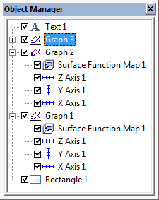
| Object and Property Manager The object manager makes the editing of any object simple. It displays all the objects in the plot document in an easy-to-use hierarchical list of objects. The objects can be selected, arranged, removed, and renamed in the object manager. When an object is selected in the object manager, it is also selected in the plot window. Changes made in one location are automatically reflected in the other. Select multiple objects at one time to make editing even faster! Click and drag objects in the object manager to change the drawing order in the graph. |
 |
| When an object is selected in the object manager, changes to the object can be made in the property manager. The property manager is a docked window that is always displayed on the screen. You can make the property manager floating or close it, if you do not want it to display. All of the properties for an object are listed in the property manager. For instance, in the XYZ Bar Chart selected in the above object manager, you may want to change the background color or style. Once the object is selected, the change can be made immediately in the property manager. The change automatically updates the graph. |
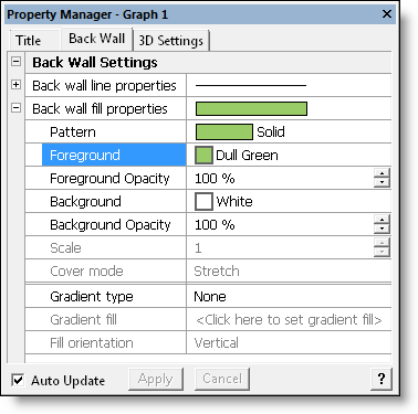 Make changes to the graph in the property manager and Make changes to the graph in the property manager and the graph automatically updates to show the change. |
| Labels and Curve Filling Labels can be added to all graph types. All properties of the labels can be changed easily, including numeric format, adding bold or italics, changing the font size or style, or changing the label color. In addition, labels can be moved so that neighboring labels do not overlap. Grapher adds the ability to quickly move labels for all graph types with the mouse. Select only the label you want to move and effortlessly drag it to a new location. Labels can also be moved with the keyboard for finer adjustments. Move labels on the plot labels, axis labels, axis titles, and graph titles using the Move Labels command. Most graph types also support curve filling. Fill can be defined between two curves or by using a single curve. With a single curve, fill above, below, to the left, or to the right of the curve. Choose to fill to the axis minimum or maximum or to a customized data value. |
 |
Worksheet Features
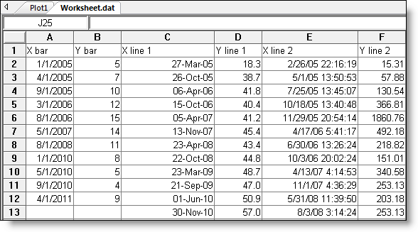
Grapher lets you work with your data in many ways to achieve the exact output you want. Grapher includes a full-featured worksheet for creating, opening, editing, and saving data files. Data files can be up to one billion rows and columns, subject to available memory. You can cut, copy, and paste data within the Grapher worksheet or between applications.
Features
- Display, enter, edit, print and save data.
- Open files in ACCDB, BLN, BNA, CSV, DAT, DBF, MDB, SLK, TXT, XLS, and XLSX formats
- Import a database directly into the Grapher worksheet
- Double precision capabilities allow up to 15 digits without loss of precision.
- CalcPerform data transformations using advanced mathematical functions
- Sort data using multiple columns
- Use the Find/Replace function in the worksheet to easily find or replace your data
- Print the worksheet
- Save your data in BLN, BNA, CSV, DAT, SLK, TXT, and XLS formats.
- The number of data points the worksheet can handle is only limited by the amount of memory available on your computer (up to 1 billion rows x 1 billion columns)
- Cell formatting includes background colors and cell height and width.
- Include formatting information when copying to the worksheet.
- Select a point on the graph and highlight the point in the worksheet.
- View a list of all worksheets associated with a graph.
- Export data from fit curves, function plots, histograms, rose diagrams, and wind charts to create new data files.
- Update command allows worksheets that are edited in other programs to update immediately in Grapher.
- Embedded Excel window allows the use of Microsoft Excel from within Grapher.
- Create mathematical transforms on columns, rows, or individual cells.
- Directly reference ACCDB and MDB tables and queries. Have the graph automatically update when the file changes.ulate numerous statistical functions on
- individual columns of data.
Automation
Create your own scripts to automate repetitive tasks! Don't spend time doing the same process over and over again – write a simple script to simplify your life!
Operations performed interactively can be controlled using an automation-compatible programming language such as Visual Basic, C++, or Perl. Grapher includes Scripter, a built-in Visual Basic compatible programming environment that lets you write, edit, debug, and run scripts. Why do more work than you need when you have Grapher working for you!
Automate Grapher from any Active X Automation compatible client such as Visual BASIC or use Golden Software's Scripter.
Record scripts directly in Grapher using the new Script Recording feature! This allows you to record all of the steps necessary to create any graph.
Embed and link Grapher into other applications.
Embed and link documents from other applications into Grapher.
- Grapher is packed full of additional features designed to help you communicate effectively and professionally.
- Edit multiple objects at once.
- Add legends to graphs.
- Customize Grapher by selecting the default settings. Customize most settings for each graph type!
- Drag and drop plots into or out of graphs and to another graph.
- Control line styles, color, opacity, and width.
- Add drawing objects to any graph such as points, lines, polygons, rectangles and ellipses.
- Create custom colors, lines, and fill patterns.
- Display clipped bars to the clipping limit.
- Clip fit curves and confidence intervals.
- Reshape polylines and polygons using the reshape tool.
- Combine and break apart composite objects.
- Edit individual objects in a composite without first breaking apart.
- Rotate all drawn objects, imported objects and graphs.
- View all objects using the Object Manager.
- Edit all objects in the tabbed Property Manager.
- Keep the Object Manager and Property Manager available -- even while editing.
- Lock the position of any object to prevent accidental movements.
- Use the Arrange command to move objects forwards or backwards.
- Add a variety of arrows to the ends of polylines.
- Digitize data from a graph using a large crosshair that extends to the rulers. Write the data to a ASCII file to create new graphs.
- Fix the digitizing process directly to the line or digitize anywhere in the plot window.
- Display and edit detailed areas of a graph using the Zoom commands.
- Calculate the area under a curve.
- Switch between two different plot types. For example, change your line plot into a bar chart.
- Switch between 2D and 3D XYY plots. For example, change your line plot into a ribbon/wall plot.
- Use commas for decimal separators.
- Use any character for thousands separators.
- Reload all data for a graph with a single command.
- Change the worksheet for any graph.
- Click on a graph and have the data highlighted in the worksheet.
- Copy and paste graphs into most Windows applications.
- Print to any supported Windows printer or plotter.
- Download free updates automatically.
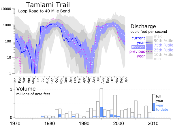
Image courtesy of Robert Sobczak, Big Cypress National Preserve, Florida.
Create the exact graph you want, every time using the full capabilities of Grapher.