Base Maps
Base maps contain boundaries without any data representation. Base maps can be used with other maps to show features such as roads, streams, city locations, boundaries that have no data associated with them, and so on.

Contour Maps
Contour Maps take discrete data measurements, interpolate between them to create a uniform grid, and then display lines of constant values.
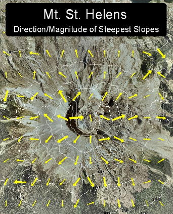
Vector Maps
Vector maps interpolate discrete data measurements to create a uniform grid and display arrows that indicate the direction and magnitude of the steepest slopes across the grid.
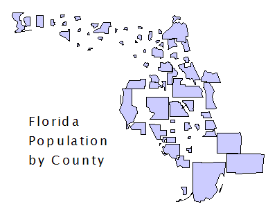
Non-Contiguous Cartograms
Non-Contiguous cartograms represent data values by changing the size of the associated area objects while retaining their original shapes.
Pin Maps
Pin maps are point location maps that draw a point at a particular location on a map.

Hatch Maps
Hatch maps use colors and fill patterns to represent data ranges or classes of data for each area on the map.

Density Maps
Density maps also called dot density maps, use symbols to represent data values for areas on a map. On a density map, each symbol represents some data value, so the number of symbols drawn in an area is in relation to the data values associated with that area.

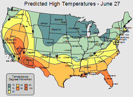
Gradient Maps
Gradient maps display a continuous range of colors by interpolating between discrete data points.

Dorling Cartograms
Cartograms represent data values by changing the size of the associated area object. The Dorling cartogram replaces the original shape with a circle.

Symbol Maps
Symbol maps place a scaled symbol on an area, curve, or point location on the map. The symbols are scaled in proportion to the data values represented for each area or point.

Territory Maps
Territory maps group objects into territories and provide statistical information about the data associated with each set of objects.

Pie Maps
Pie maps are a way to represent several data values by drawing a proportionally sized pie chart for each location.

Bar Maps
Bar maps are a way to represent several data values by drawing a bar chart for each location.

Line Graph Maps
Line graph maps show line graphs of the data at each centroid location. By looking at a single line graph, you can see how the individual data value relates to the whole data set.

Prism Maps
Prism maps draw each area, curve, or point as a raised prism, where the height of the prism is relative to the associated data value. Classed colors can also be assigned to prism map boundary objects, allowing you to display two variables on a single map!

Flow Maps
Flow maps show data based on line thickness. Flow map lines can be drawn from one base map object to another, or you can associate a data file with a base map of curves to create a flow map.
